Tuesday, May 25, 2010
Friday, May 21, 2010
Wednesday, May 19, 2010
Thursday, May 13, 2010
Thursday, May 6, 2010
Book
So for the this project we were able to pick what we wanted are book to be about. I chose to do a book about nature. I used Viviana as a model and dressed her like a hippie, then we went out to the field and started taking a lot of photos. I also took photos of trees, grass flowers ect.. to add in there. The pages of my book were stained with coffee and they ended up looking really good( and it was my first time!). The cover of my book was painted a dark wine color and then i added these gold corners on all of my photos, i also put real plants in my book. I was actually really happy with the outcome of my photos and my book. I used it in my senior ex but i did not get any feed back so i do not know if they even liked it. This was a cool project because we had freedom and i was able to make a book, which are really fun to make. I think you should continue doing this project with your future classes. PACE
Wednesday, May 5, 2010
Wednesday, April 21, 2010
Wednesday, April 14, 2010
Proposal
I really enjoyed this project because we were able to do whatever we wanted. We got to choose what we wanted to shoot and when it would be due, it still had to be a resonable time frame. I had a lot of fun with this, since i am going to do vintage, pin up & rockabilly stlye photos for my senior ex, so i decided i would start working on that. I am not going to end up using this photo, only because i think it is to simple. I really like the photo, the lighting looks good( i did fix the lighting on photoshop). I desaturated the colors to give it that old look. Alexis is such a good model, i am getting addicted to using her for everything, i need to find more people that are good in front of the camera. I wasn't happy with my models hair, i wish it was down but then that might of looked wierd with the scarf. I didn't notice the braclet on her ankle until after i was done shooting, but my eye draws to it and not in a good way. I wish i knew how to erase that on photoshop. I like this project, it gave me total freedom.
Thursday, March 18, 2010
Website!!
For this assignment i had an idea of shooting a group of photographers with lights and the whole shabam, because i would like to show photography on the school website, i had never seen that before. I tried but i had trouble setting the people up, i looked up some of Annie Leibovitz group photos to try to help me place people but i still have a difficult time with it. So i decided to do another photo shoot, this one was of individuals. I wasn't very pleased with my photos because when i look at them i know that they would not be chosen to go on the website. I picked the one of Brandon because i like what he was wearing that day so i threw him in front of the camera and took some shots of him. He is not use to taking photos so it was a challenge to get the right look on his face. I love shooting Alexis, she is such a good model and so photogenic. I just have trouble being demanding and telling her what to do. I just need help directing my models. I fixed the brightness and contrast, exposure, sharpness on Photoshop.
Wednesday, March 3, 2010
Location Hunting!!!!
So i didn't know that you needed to have a person in the location photos, but i found some really good locations. Two of them were actually in the class room i guess i just never thought about shooting there. I like the lunch table a lot because its really secluded back there and i have not seen anyone shoot there yet. I like the tilted umbrella, it adds something different to the picture. It does not make it look like it's perfect, it's also a little dark back there but i like that. The photo of the negatives looks really cool, i think if i put a model that looks urban there it could work. i like the last photo of the curtain to the dark room a lot, i have never seen anyone shoot right there, i could use it like a back drop. I would like to have a model that looks very high class and fashionable and put them in front of that. This assignment really helped me find new locations to shoot. I found a couple of more places around the school but i didn't upload them on my blog. I found his project really helpful, thanks Ms. Miles!!!
Thursday, February 4, 2010
Portfolio
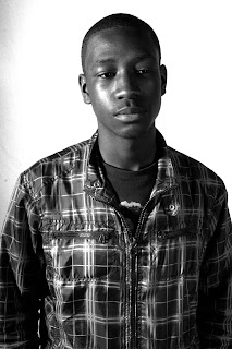
It was really hard getting the light right for this photo, but i really ended up liking it.
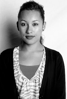
I don't like the shadow in this photo.
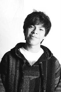
He was really hard to work with!!
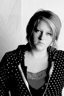
I wish i would of used more light. Olivia was fun to work with.
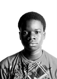
I really liked my model, he was easy to work with.
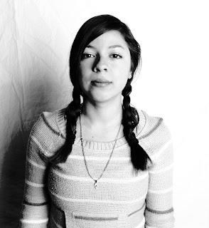
I don't like this picture, i feel like she's too washed out.
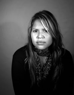
I like this photo but i don't think it goes with my Richard Avedon attempt. I shoot this with out strobe.
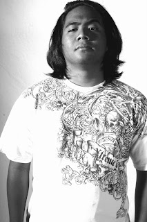
I really like Shooting Arturo, he listens to everything that i say. I think his face works good for my Richard Avedon attempt.
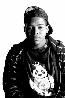
I didn't have any issues shooting my man Tre'von haha.
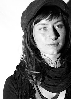
This is my favorite picture, everything worked out really good. Ashley Reed is a great model.
Shooting my portfolio was fun and stressful at the same time. I tried to take photos showing the youth of San Diego with a little bit of a Richard Avedon inspiration. I had more than enough time to shoot all my photos, but when i wanted to re-shot the ones i didn't like i ran out of time. So i started shooting models that i would usually shoot like Ashley and Viviana, this is my comfort zone so i needed to do something else. The photo of Ashley is my favorite because i really like the way she looks, i also really like the shoot of Andrew the younger African American boy because of his features, i think they are very beautiful. When i shoot Alexis i only used the hot lamps so the background didn't come out white, which doesn't really work for Avedon style photo shoot. The photo of Viviana and Jasmine were the two that i liked the least, they look washed out and i feel like they are just to sweet looking which is fine but not what i wanted. The picture of Andrew(third) i don't really know if i like it, he was really hard to shoot! He was really awkward and didn't take direction very well. I loved shooting Arturo, he was a really good model and gave me exactly what i asked for, i really don't like his shirt. I like the photo of Tre'von because the lighting worked really well and i learned that shooting people with different skin colors is very difficult but something i want to get better at. I 'am really appreciative that we were giving the opportunity to practice shooting a portfolio before we dive into doing our senior ex. I learned a lot of what i should do and what i shouldn't and i 'am definitely going to add all my knowledge when i' am shooting my final portfolio.
Wednesday, January 27, 2010
Portfolio test shot #2
Ok so the second attempt for my portfolio was even worse than the first one. For the first one i was shooting people, kind of like portraiture and then i decided to change it and shoot nature.I still used people in the picture but they weren't the main focus. I did shallow depth of field, beacsue one time i was just shooting for fun and i really liked how it looked. It just wasn't very good, i didn't like how any of my photographs looked. I think it was because i wasn't having a very good day and i couldn't get my artistic juices flowing:( I tried fixing it up on photoshop but i didn't even know what to do. So i really do love shooting nature, and capturing the beauty of it but i don't think i 'm going to do that for my portfolio. I am going back to focusing on people and i 'm going to do a mixture of Richard Aveadon and Stephanie Cota. So lets see hoe that works our hopefully better!!
Subscribe to:
Posts (Atom)